Tete-A-Tete salon website redesign
Project overview
Timeline: 2 months
Team: 2 (1 designer, 1 engineer)
Tools: Figma, InVision


 View website
Problem statement
Benchmark criteria
After redesigning the website we expect Tete-A-Tete salon to have:
- at least 50% more first-time appointments in a book
- up to 80% less information inquiry calls
- at least 70% of clients’ trust in competency of stylists
Solutions
- Change information architecture of the website.
- Eliminate distractions and unnecessary data.
- Chunk and logically group the information.
- Provide lacking information based on user’s insights.
Outcomes
- The updated design was well received within Tete-A-Tete company.
- It increased communication within the company.
- It inspired stylists to document their best works in order to showcase their skills and expertise.
Key activities


Our user


Website analysis and solutions
- The home page that feels too cluttered.
- It is difficult to scan because of a bunch of text and a busy layout.


- Get rid of an unnecessary block of text.
- Make a button for Covid policy and move contact info to the page where it belongs.
- Funnel user’s attention in a logical way while answering the questions our user might have.


- The navigation bar has way too many menu items (8) while all they want is just to get a service.
- The wording “raving clients” is not clear enough and does not fully explain what this page is about.


- Get rid of an unnecessary block of text.
- Make a button for Covid policy and move contact info to the page where it belongs.
- Funnel user’s attention in a logical way while answering the questions our user might have.


- The price list looks visually overwhelming.
- Half of the services don’t give you any idea of how much they can cost and just marked as “Prices vary”.
- Small pictures look funny on a desktop version.

- Chunk the extensive price lists into smaller and visually divided tables.
- Use price ranges whenever it is possible.
- Make pictures responsive.

- Colored text in paragraphs creates poor readability.
- The size of text in paragraphs is too small.

- Use colored text only for links and headers and make paragraphs black.
- Put description of a service in a pop-up window and make the size of paragraph bigger.

Wireframing
Usability testing
1. Layout & responsiveness challenge
The biggest issue for me was designing the most important part of the website – list of services as it had to be visible and easily accessible on all platforms. I’ve tried various ways of displaying them – buttons on a single background, images with text descriptions scrolled to the sides and images with text stacked under each other. The last one turned out to be the most user friendly and fits well both desktop and mobile versions.


2. The signifier for sliding interaction represented by three dots wasn’t clear for users. As a result, I got rid of dots and made menu items clickable while still maintaining screens’ ability to slide.


3. The fixed header that folds in as you scroll down is a great idea which I picked up from the original Tete-A-Tete website. While it is providing constant access to site navigation it gets thinner and saves the valuable space for the content. However, according to user insights the fact that the name of the salon, its logo, simply disappears when you scroll looks like a system error and leaves users confused. To avoid poor readability caused by reducing size of the logo I chose to make a transition from logo (initial state) to a text title.


Next steps:
- Keep up to date online appearance on the social networks such as Instagram and Facebook.
- Add online booking feature.
- Launch new marketing campaigns via Constant Contact.
- Collaborate with Groupon.

View next...

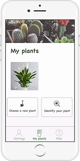
B2C application "Bloom"
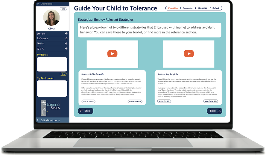
Educational micro-course for Learning Seeds, Inc.
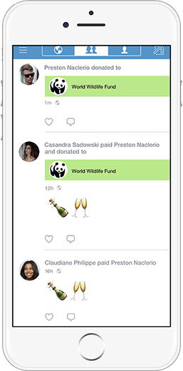
Donation feature for Venmo app (conceptual)
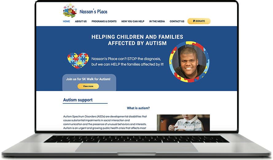
Nassan’s Place website redesign